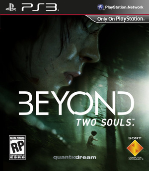
If you haven’t been following the development of Beyond: Two Souls you should probably start looking into it. Not only does this game look to be one of the most visually spectacular games I’ve seen in a long time, it’s striving to become a game that breaks all the molds that video games seem to fall in to. Not only are they featuring a female protagonist, which according to some developers is “tough to justify,” but they’re trying pretty hard to make a female fan base their main audience through other steps of the development cycle. For instance, the cover art of the game.
Quantic Dreams has come out saying that the reasoning for the game’s cover lacking a “gun-toting Ellen Page” is that they “…desire for Beyond: Two Souls is to reach a mature audience that might not be particularly interested in traditional AAA games.” Which is a fancy way of them saying they’re trying to reach a female audience. QD goes on to say specifically that they are trying to reach women with this game which is where things get kind of dicey, “…with Beyond we are hoping that it will appeal, for instance, to women. Because of the themes that we have that are similar to what women like in certain TV series, or watching certain movies, for instance, or reading certain books.” What books, movies, and TV shows are they looking to? I, for one, would be quite worried if it turned out to be a game that portrays themes similar to those found in Twilight or Fifty Shade of Grey.
Regardless of what they are trying to portray with the cover art they still need to be able to convey what the game is about and what kind of gameplay a player can expect, all while still appealing to their targeted audience. Patricia Hernandez of Kotaku discusses the game’s cover art in a recent article and brings up a good point, “…were I not following Beyond: Two Souls, I’d have zero clue what kind of game it is.” Take a look for yourself:
Now, I’ve been following the coverage of this game quite thoroughly and the gameplay is extremely exciting even though it doesn’t seem to be super action packed, but looking at that cover I have no clue what it is they are trying to portray… thoughtfulness? Running in the woods? I just don’t get a feel for the game from looking at the cover alone and unless you’re a hardcore gamer or a Heavy Rain fan and have been following this all throughout development I don’t think this cover would push you to purchase the game. But, let’s be real, the cover art alone should not sell you on game!
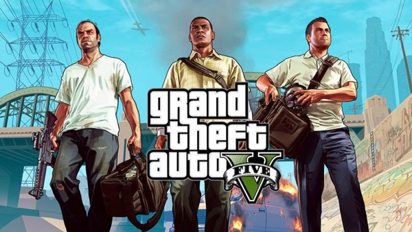
The other side of their choice in cover art is that they refused to conform to the industry standard “Male protagonist carrying gun” cover for a game that sees a fair amount of action sequences. While they are obviously pushing the idea that they are trying to be more sensitive to a different side of gaming, one has to wonder if they made this choice because of the recent talks with Vice President Joe Biden over the supposed “fault” video games have in the violence in our nation. It makes me wonder if QD is making an attempt to sell this game to the American public in a post-Sandy Hook massacre world. Are they trying to make an effort to tone down the violence in the marketing sphere of this game? And if they are, what effect does this cover actually have over that effort. Honestly, the images on the covers of games are not normally violent; yes they have pictures of people holding guns, but rarely do they actually show the gun toting character to be using it in a violent manner against another person. I do not believe that video games have any fault in the violent acts that occur in the world, but if we are being led to believe that the companies making the games accept fault why would the cover make a difference anyways? It is the actions you take within the game that have the most violence, not the picture you see on the cover.
What do you think of the cover? Do you think that Quantic Dreams is actually trying to include a female audience or are they a puppet to the government’s plan to rid us of our violent video games?


2 thoughts on “Artistic Renderings’ How Cover Art Sells a Game”
Judging from the cover alone I’d say it looks like a survival horror, or maybe an adventure game – that would be my guess anyway.
Personally, I don’t find it all that appealing, I mean she’s scratched-up with her eyes closed and she’s running away from something (I think). Maybe if I was more of a horror fan I’d like it.
When I was a teen I was drawn to the first TLJ game based on the front the cover. I read the blurb before buying of course, but the protagonist on the front looks mysterious without being dis-empowered.
I’m kind of with you on this one. I’m not a fan of images of women who look like they’ve been battered. Maybe something more mystical considering the actual subject matter of the game. On a whole I am in favor of fewer guns and ultra violent images on game covers because the are so prominently placed in stores and little ones like Pea see them. For this reason, I try to make sure that (if we do look at games together) that she doesn’t see anything to violent by keeping her close at hand, usually in the kids’ games aisle, and having the person working bring me games. This cuts down on impulse buys, which is good for me and bad for them. At home we even have some games that are put out of reach or have paper taped over the overs (ZombiU was the latest offender) because they are so visually disturbing. I’m sure that I’m not the only parent has to be careful of this.