In my continuing look at game covers, I thought I’d explore the best-rated games of 2013 according to Metacritic’s compiled review scores. So far, I’ve looked at top-selling games instead of best-rated, or I’ve looked at a particular selection, as when exploring Xbox indies, and the results have been surprisingly consistent in terms of gender and racial presentation and presentation of human figures, regardless of the criteria. I was curious to see if there would be a difference among critically acclaimed titles. Can the industry’s supposed best, per review ratings, bring something else to the table?
After removing duplicates, I present the top-rated games of 2013, based on professional review scores, as compiled be Metacritic:
- Grand Theft Auto V
- The Last of Us
- BioShock Infinite
- Super Mario 3D World
- Fire Emblem: Awakening
- Rayman Legends
- Fez
- flower
- The Legend of Zelda: A Link Between Worlds
- The Legend of Zelda: The Wind Waker HD
- Spelunky
- Brothers: A Tale of Two Sons
- Dota 2
Now, this is an interesting group of games in terms of cover art, for several reasons. First, some of these games don’t really have official covers in the typical sense, due to the platforms and presentation, like Dota 2 and Spelunky (though there are images that are used in this sense). There’s also a higher number of games here without humanoid characters, as compared to the best-selling lists, and a lot of games with nonrealistic visuals. While the best-selling lists are heavy with realism and/or shooters, here those games are the minority.
That said, here are the stats:
Discernible humanoid figures: 35 (some questionable)
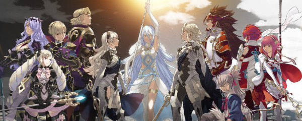
Female figures: 13 — While there was one on the Fire Emblem cover I was uncertain about, even after searching wikis (I didn’t play it), this is still a lot of women in comparison to past years. The Wind Waker and Fire Emblem boxes are heavy with female characters.
Scantily clad female figures: 5 — Based on clear views in box art alone. Character art and further images would ratchet this number up.
Persons of color: 1 — Possibly a second as well, but indeterminate. Also interesting to note, the sole clear person of color is a black man holding a gun.
Covers that featured no humanoid figures: 3 — Dota 2’s “box” is just a logo, and flower and Fez wouldn’t, anyway.
Ass shots: One and a half — This one is particularly interesting as a category, since there are a number of things that could be viewed as posterior shots, but have the same cover-up techniques for the men I first noticed when I began analyzing the trend as I looked at Remember Me. Male figures are given some sort of cover-up, like a shirttail, to prevent any posterior definition. That’s used here with Joel in The Last of Us. Fire Emblem is the source of the half, and I call it a half because there are a number of profile and not-complete posterior shots, and the one that is obvious is covered with a (short) skirt with no definition. But that’s counter-balanced by a not-quite-upskirt shot. Fire Emblem should be the most gratuitous offender on this list in general, for its scantily clad women, but a close look at The Last of Us revealed something I’d never noticed: 14-year-old Ellie is shown in the traditional (for women) looking-over-the-shoulder shot that is meant to show off boobs and butts. Now, in this case, Ellie’s holding the strap of her backpack, so the view of her chest is obscured, but the fact that she’s in that position at all, with all it entails, is a little problematic to my eye. Of course, the work Naughty Dog did otherwise to avoid sexualizing Ellie failed, as suggested search terms for her include “hot” and results yield discussions about Ellie being raped.
While it’s refreshing to see the most critically acclaimed titles of 2013 had a higher number of women on the covers, it’s alarming that the only person of color featured was a man in a violent image, on the GTA V box, and that nearly half the women were less than fully clothed — and after taking young Ellie and the Mario/Zelda games out of the equation, we’re left with only women either scantily clad or sexualized in some way. The female Fire Emblem characters who are least sexualized in their presentations are not on the box. Interesting to note, too, that other presentations of Spelunky feature a large-breasted woman in a low-cut dress, but the art for this release seemed to feature only the male character, so that’s the one I used, or the results would be different.


